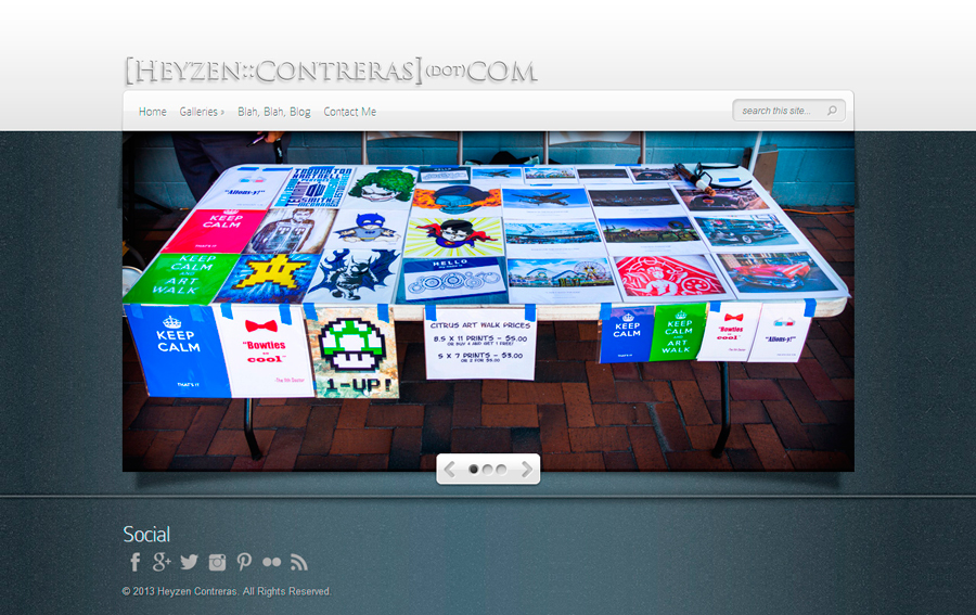
Less than a year ago an episode of Doctor Who inspired me to redo the design of my personal blog. Although the design was sleeker, nicer and easier to navigate than the previous iteration, I felt that my needs outgrew it’s functionality and it’s limitations were becoming more and more apparent.
For the past several years I’ve been operating 2 different online presences. My personal blog and my photography site which is where I sent clients and potential clients. Although my name was attached to both sites (4 if you count the 2 SmugMug accounts I had open) there really wasn’t any synergy between them. Design wise, [Heyzen:Contreras](dot)com and [Heyzen:Contreras] Photography and Design were structurally similar but that’s where the similarities ended. Over time this was not only costly but it also got confusing managing who to send to which site. Out of frustration, a couple of months ago I decided to take the synergistic approach and combine all four sites and regenerate into the site you see before you:
[Heyzen:Contreras] | Photography
So take a look around and leave a comment at the end of this post, I’d love to hear from you! Oh, and for those of you that are joining me here for the fist time, welcome and thanks for coming! In case you’re wondering what the old site looked like, here it is:

