Regeneration.
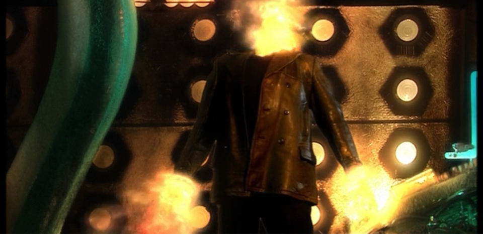
At its most elementary level, regeneration is defined as rebirth or renewal. When I first started this site/blog, I had decided that in a chameleon like fashion the site design would parallel the changing seasons. Soon after, I realized that putting up a new design that frequently was too time consuming. My plan changed into one where I would update the design and structure every year, with an occasional update to homepage graphics to help announce milestones and such. This worked for a while but earlier this year after finishing ‘Project: 3six5‘ I realized that my site was very bland. I realized that the site structure never really changed, just the homepage graphics. As I continued my journey into the always interesting world of photography there wasn’t an easy way to show off my work and this bothered me. As a newly born “Whovian” (fan of the TV series Doctor Who), you are introduced to the process of regeneration when The Doctor is mortally wounded or simply becomes too old. The fact is that the TV show writers used this concept to bring in a new actor to play The Doctor when they needed a change. Like the changing of one of the Doctors, I needed my site to undergo that same type of personality shift and take on a new physical form.
The internet is a huge cluster of information but culling that information is quite possibly one of the most difficult tasks you can assign to someone. For weeks I searched looking for ideas. A simple design, yet full of information. Something “in-your-face”, yet subtle. Trying to sort these ideas while trying to learn general web design and coding can work you into a frenzy in and of itself, but tack on practicing your craft, holding down a full-time job and being a full-time husband/father immediately take it’s toll. After compiling tons of data and ideas, my research was about to make my head explode. But it finally happened. I found what I wanted and had a fundamental view of what my site had to and has become: a highly visual portal not only to me but to my work. The site design itself has been compressed and has indeed become very visual. Almost any image that you click on will now expand itself into a larger version. The need to click on the blog link to find new posts is gone, all new items will be announced on the homepage. Going forward, galleries will be cleaner, faster and dare I say, much prettier.
I hope that all of these changes will help my site become a frequent stop on your adventures through the interweb. Thanks for coming by and showing your support. 🙂
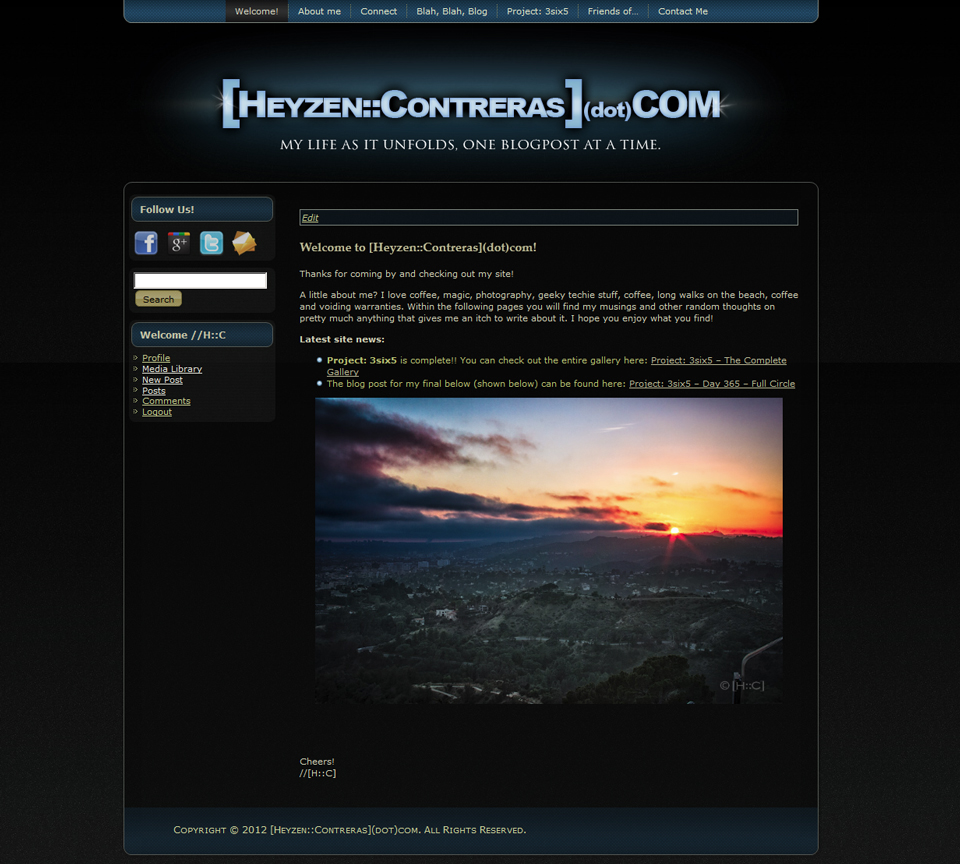
And, in case you were wondering what the site looked like before the redesign (or just forgot), here is an image:


Change is the only constant in the universe, dear brother. Nice work. I am quite the fan.