It’s been some time since I’ve written and a lot of things have gone on. If you were wondering, a lot of great things that I won’t yet get into (at least not in this post). For those of you new to visiting my site, I would like to thank you for coming and checking out what I have to say. Hopefully something written within these pages and posts is something that you can relate to. For all of you returning customers, thank you for shopping here with us… er, uh.. me.
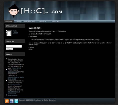
Anyhow, roughly 2 fortnights shy of the 2 year mark that I last updated the site’s design (commemorated here), I have decided over the course of my interweb hiatus that I again wanted it to change. Why? Just because I was bored with the old look. Don’t get me wrong, I like the old design and I’m definitely going to miss it and the little Heyzen head in the banner but things change and this site is no exception. The general concept of the design is the same but I wanted to update the colors and give it a “shinier” all-around look. The logo change itself comes from the fact that people kept telling me that “HC dot com” doesn’t bring up your site. Uh.. yeah… about that. Apparently that site redirect belongs to HarperCollins Publishers. To avoid any further confusion, I simply changed the logo.
For those that didn’t get to see the old design, this is it:
Thanks again for stopping by and I hope you all like the new design! Cheers!